
Veni, Vidi, Duci (Blog)
Bad Infographics
I shouldn’t let bad infographics bother me as much as they do, but I can’t help it. There are so many bad examples out there; here’s the latest one I saw, on page C1 of this morning’s Washington Post. The article had to do with America’s shrinking middle class and how members of it feel “squeezed by the pressures of diminishing opportunity, stagnant wages, and rising expenses.” Here’s the graphic I’m talking about.
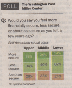
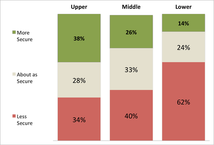
Notice the ordering of the responses on the left: more secure, less secure, about as secure. Don’t those items seem to have a natural ordering, and not the order in which they are listed? Also, there is a general association of color (i.e. green = good, red = bad) that is not followed here. Note how the (presumably) worst outcome, less secure, is shown in light green here. Shown below is a slight modification that is (IMHO) a much better represenation of what the original graphic was trying to communicate. Now the fact that 62% of those in the lower class feel less secure than they did before jumps out much more clearly.
Capice?