

A Single Number Doesn’t Always Work
Those involved with assessment and information visualization often try to get to the “nirvana” of a single number that wraps everything of interest into one. Sometimes, that just isn’t sufficient.
The traditional line graph below shows how China is catching the United States in total Gross Domestic Product (GDP). If you have a subscription to the Economist (or haven’t reached your limit of free views), the live version of this one even allows for some interactivity by incorporating exchange rate assumptions.
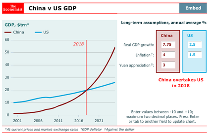
The takeaways from the visual above are essentially: (1) “Wow, the Chinese economy is going to be larger than the U.S. economy and (2) The Chinese economy has been growing faster than the U.S. economy for a few years and the growth is accelerating. Other versions I have seen online show that the crossing may occur sooner than had been previously forecast.
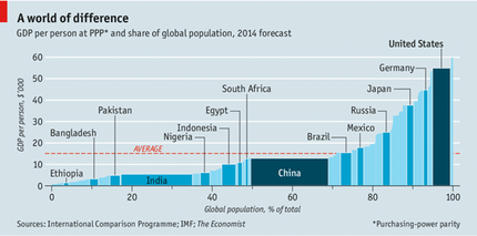
For comparison purpose, take a look at the graphic below. While it doesn’t get at the change over time, it does still show the relative size of the economies of China and the U.S. (and a number of other nations). It’s there, but hidden a little bit (think about the area of the rectangles). But, by dividing by population, it shows the GDP per person. In this metric, China is still below the U.S., Germany, Japan, Russia, Mexico, Brazil (and the world average). Interesting.
Bad Infographics
I shouldn’t let bad infographics bother me as much as they do, but I can’t help it. There are so many bad examples out there; here’s the latest one I saw, on page C1 of this morning’s Washington Post. The article had to do with America’s shrinking middle class and how members of it feel “squeezed by the pressures of diminishing opportunity, stagnant wages, and rising expenses.” Here’s the graphic I’m talking about.
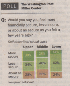
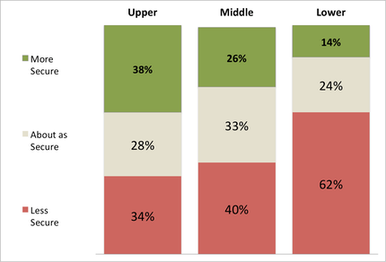
Notice the ordering of the responses on the left: more secure, less secure, about as secure. Don’t those items seem to have a natural ordering, and not the order in which they are listed? Also, there is a general association of color (i.e. green = good, red = bad) that is not followed here. Note how the (presumably) worst outcome, less secure, is shown in light green here. Shown below is a slight modification that is (IMHO) a much better represenation of what the original graphic was trying to communicate. Now the fact that 62% of those in the lower class feel less secure than they did before jumps out much more clearly.
Capice?
Histolines - the “Child" of Facebook and Wikipedia
I recently heard about Histolines, which is attempting to be a crowdsourced database timeline for events, people, etc. and accounts for location. While an interesting concept, it isn’t quite there yet. Some of the functionality is (admittedly) incomplete, but what is present works fairly well. In the video below, creator Taras Skavinskyy (when seeking crowdfunding a few months ago) describes the project by saying, “Pretend that Facebook and Wikipedia had a child.” While it isn’t a subsitute for a history book, it coudl be an interesting new source for exploration. Check it out and let me know your thoughts.
Sequestration for Dummies
Here's one attempt at explaining why sequestration will hurt more than you think it should. After all, shouldn't any government program be inefficient enough to absorb a 10% hit to help out with the deficeit and debt situation?
Let's say you make $120,000 a year. (A good income that is easily divisible by 12.) Before the beginning of the year, your employer tells you that you might have to take a 10% pay cut, but they aren't sure yet. So they're going to keep paying you the same as last year. Their plan is to let you know a few months into the year, maybe by the end of March. Then, after 3 months, they tell you they still aren't sure and will tell you in a couple more months, by the end of May. As Memorial Day nears, they finally figure out that YES … you do need to take that 10% pay cut, starting at the end of June. The problems facing you at this point are as follows:
1. They have already paid you half of your pay for the year, so they only owe you $60,000 more during the rest of the year.
2. Your mortgage payment is 44% of your income (a bit high, but not unheard of) and can't be changed. It is deducted directly from your paycheck, so you have to take the 10% pay cut (which works out to $12,000) from the other 56% of the remaining 50% of your income (which is $34K).
This means that your "10% pay cut" amounts to an effective 30+% cut in your remaining paychecks (since the $12K must come from the $34K that is eligible to be cut). OUCH.
Add to this the fact that the 10% must be cut from each of your spending accounts (insurance, food, transportation, entertainment, etc.). Some of these you may have agreements (contracts) with businesses for on an annual basis. Hmmm.
Multiply the amount by a million or so and shift the dates by 3 months to reflect the Federal Government's Fiscal Year (OCT - SEP) and … that the situation, in a nutshell, facing government departments.
The Plural of Anecdote Is (Not?) Data

On various occasions (most recently today in an email message), I have heard it said that, "The plural of anecdote is not data." Curious as to where this originated, I did a quick web search using my search engine of choice. Some, like the Quotes About Data Processing website attribute the statement to Frank Kotsonis. Others, like the source of the above image, credit Roger Brinner. Others claim that the original statement was the opposite, i.e. "The plural of anecdote IS data." by Raymond Wolfinger. Two implications (of the original statement) found at the previous link are: 1) data is usually collected in the first place because anecdotal evidence flagged something as worthy of investigation, and 2) the idea that data alone can prove something as true, while anecdotes cannot is absurd. Neither data nor anecdotes prove anything. Scientific theories are never, ever, ever proven. They can only be disproven.
In looking around online, I found that others have similarly spent time wondering about and even blogging on this topic. Check out Skeptical Medicine for one such example.
How Can We Tame Wicked Messes?
The title of this post comes from David Hancock's 2010 book Tame, Messy, and Wicked Risk Leadership. Also, thanks to Mark Phillips for the inspiration behind this post; re-reading his article "Using Risk Management to Solve Strategic Problems," which appeared in Oct 2012 in Small Wars Journal was the motivation for my thinking about this topic.
First, some definitions regarding the different types of problems (and risks) … tame, wicked, and messy problems (according to Hancock).
A tame problem (risk) has straightforward, often linear, causal relationships and can often be solved by analytical methods. Got it; we've been dealing with these for eons.
A messy problem (risk) has a high level of system complexity and may have various interrelationships or interdependencies that require a holistic approach. Even these are not uncommon.
A wicked problem (risk) is characterized by a high level of behavioral complexity, i.e. people who do not act in predictable ways. A fair amount has been written about these in recen tyears.
So then … what is a wicked mess? Somewhat obviously, it is a problem (risk) with both behavioral AND systemic complexity, often with interaction between them.
While Hancock primarily considers problems from engineering and acquisition, Phillips suggests that they can be used in strategy development, even at the national level. He proposes (rightly, IMO) that most significant policy challenges can be categorized as wicked messes. The question then becomes … how does this help us in addressing them?
Top-Down or Bottom-Up Analytics?
Should your approach to analytics be top-down (strategic) or bottom-up (operational)? Both approaches have merit, but I would argue that you shouldn't rely on just one. To understand the difference between the two approaches, look at the image below; this figure (and the entire idea for this entry), comes from Morten Kamp's "All About Human Capital" blog.
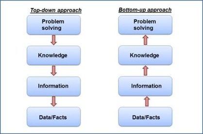
Many take the bottom-up approach, perhaps because it is easier. They look through their available data (or "Big Data" for some) and look for ways to measure, visualize, and trend it, looking for links between the data and things they think are important. OK; there's some value there, in that good analytics from a bottom-up strategy can show you connections you hadn't seen before and maybe even challenge your business strategy.
In comparison, the top-down approach starts with the business strategy and looks for areas to focus operational efforts. Then, you find the desired knowledge you require to make the right decision. The you design the data required to provide you with this knowledge.
Bottom line … analytics is one tool to help leaders make better decisions. Depending on the type of decisions you are making (i.e. strategic or operational), your approach to analytics must also change. Don’t just look at the data you currently have (but do that too); instead what data you need to create the most value from your analytics effort.
The Academic - Practitioner (Non)-Divide
In the past, when I renewed my membership to the Institute for Operations Research and Management sciences (INFORMS), one of the questions I was asked to answer to update my membership profile bothered me. The question provided only two checkboxes, of which only one could be selected. Specifically, I was asked to identify myself as primarily an "Academic" OR a "Practitioner" (of Operations Research, or OR). (Note the two different uses of the word/acronymn "OR" in the previous sentence.)
However, I consider myself to be both an academic AND a practitioner. If you consider there to be a fence or dividing line between the two, I would say that I have one foot firmly on the ground on either side of it. But, I don't see it as being quite so clear cut. For OR practitioners, it is important to have a solid academic background supporting your work. Similarly, to be a good academic, having practical experience is invaluable to both teaching and research efforts.
Upon renewing my membership for 2013, I noticed that the question is now more clear in that it asks for the "primary employment classification" and offers five choices -- academic, government, business, consulting, retired/underemployed/other. And, there is another question that allows members to specify the various roles that they perform.
Olympics Provide Another Teaching Example for Decision Analysts
During the 2002 (Salt Lake City) Winter Olympic Games, the International Skating Union rules at the time did not satisfy the "Independence of Irrelevant Alternatives" criterion. Scores were calculated as the sum of half the rank in the short program plus the rank in the free skate. Prior to the last skater in the free skate, Irina Slutskaya (Russia), the leaders were Sarah Hughes, Michelle Kwan, and Sasha Cohen (all USA). Slutskaya finished 2nd in the free skate and overall. So Sarah Hughes won the Gold medal. However, had Slutskaya finished third (or worse), the Gold would have gone instead to Michelle Kwan. Read more about this here.
Now, at the 2012 (London) Summer Olympic Games, we get another teaching example. This time, it wasn't ice skating, but gymnastics (another "scoring" not timed event). There was no doubt as to who finished first in the Women's All-Around competition-- Gaby Douglas (USA) earned the Gold medal with 62.232 points, while Viktoria Komova (Russia) earned the Silver medal with 61.973 points). However, at the end of the four events (vault, uneven bars, balance beam, and floor exercise), two gymnasts (Aliya Mustafina - Russia and Aly Raisman - USA) were tied for third place with exactly 59.566 points. In swimming and other races ties like this happen from time to time and multiple medals are awarded. However, under the current rules for gymnastics, the lowest event score for each tied participant is removed. So, after removing the beam scores for each (Mustafina's 13.633 and Raisman's 14.200), Mustafina was declared the Bronze medal winner since she had the highest score on the other three events. At first glance, I thought this was an example of the "maximize the minimum" decision rule, but after further consideration do not believe it is. Not sure what the logic behind it is. Any thoughts from other decision analysts out there?
Seigniorage. What's that?
According to a recent Economist article, the last Canadian penny was minted on May 4, 2012. Besides not being worth much, it cost more to produce than it was worth. The same situation exists for the U.S. penny (which costs 2.4 cents to make) and nickel (which costs 11.2 cents to produce). However, the losses on the low-denomination coins are offset by profits the government makes by producing other notes and coins for (in many cases, far) less than face value. Accordign the the Economist, "this profit, known as seigniorage, is one of the great hidden sources of government revenue." It was even been suggested as a way to solve the 2011 U.S. debt ceiling crisis (see Wikipedia entry).

Photo Source: Wikimedia Commons
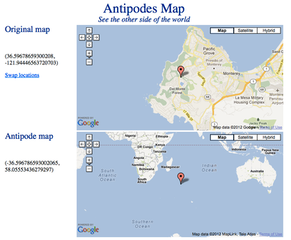
Antipode: The Other Side of the World
As a kid, I remember being told about "digging a hole to China." Turns out, in order to do so, you'd have to be somewhere in South America--in Argentina, Chile, Uraguay, Paraguay, or southern Brazil. Or, one either the ocean floor of the South Atlantic or South Pacific. Digging through the core from where I grew up would have left me somewhat distant from the soutwest corner of Austraia. Digging down from our current home in Pebble Beach, CA would result in a location in the Indian Ocean, southeast of Madagascar. All of this neat information comes to you from Antipode Map. See graphic below. Special thanks to Dave, over at PhilosFX for pointing this out.
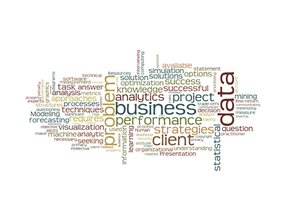
INFORMS Analytics Certification Program Update
A week ago, I attended the INFORMS Conference on Business Analytics and Operations Research in Huntington Beach, CA. Besides being a member of the organizing committee, helping to put together the Public Sector track, I was pressed into service as a backup speaker to fill in for someone who could not be there. Additionally, I spent some time manning the INFORMS booth to answer questions about the analytics certification program (called Certified Analytics Professional or CAP) that INFORMS is developing. This is an effort I have been involved in since 2008, when it was knows as an "OR Credential" instead of "Analytics Certification." There are indeed reasons for the change in terminology. While all details are not yet releasable (the INFORMS Certification Task Force and Analytics Certification Job Task Analysis Working Group continuing development of the program), here is a word cloud of the words that appear in the draft domain, task, and knowledge statements.
For more information on the CAP program, please read the recent article, The Shape of Analytics Certification, that I authored with a few others (Jack Levis, Bill Klimack, and Michael Rappa) involved in the program's development.
What do you mean by "Big Data?"
Today, I participated in the "Innovations and Big Data Workshop" in San Jose, CA. It was organized by Diego Klabjan, who is heading up Northwestern University's Master of Science in Analytics program. Thanks also to Terry Cryan, Director of Meetings at INFORMS.
One of the topics that each speaker was asked to address was, "What do you mean by 'Big Data'?" Here are some of the answers offered up by various presenters:
- Not just about size, but also about emerging data types (that are not relational database friendly, but rather semi-structured at best).
- Must include data that is heterogeneous, over time.
- 3Vs: Volume, Velocity, Variety (from an IDC White Paper)
- Whatever causes you to work outside your comfort zone (in terms of volume, complexity, velocity, and technique).
- A lot more than just having a lot of data.
I like the "outside your comfort zone" definition. It's kind of like the old ad about reruns on NBC… "if you haven't seen it, it's new to you."
While I'm on the topic, there was an interesting quote about Big Data in a presentation by Hilary Mason, Chief Scientist at bit.ly the other week, during a "Droptalks" presentation at Dropbox. She said,
We work in an area that is nominally called Big Data. I really hate this phrase; it's just data. I dislike the phrase because I spend most of my time figure out ways to take the Big Data and make it small enough to do something interesting with it.
You can watch the video, posted on YouTube, below. (The quote is at about the 7 minute mark.) She also had an interesting definition of Analytics, but I'll save that for another post.
What do I want to be (do) when I grow up?
A friend's recent posting on Facebook prompted this entry. She asked if anyone had any ideas what she should be when she grows up. (Keep in mind that we are both in our mid-40s at this point.)
My comment back to her was that, it isn't so much about what you want to "be," but more about what you want to "do." This is prompted by a quote from the late Air Force visionary John Boyd (of OODA Loop fame):
One day you will come to a fork in the road. And you're going to have to make a decision about what direction you want to go. If you go that way you can BE SOMEBODY. Or you can go that way and you can DO SOMETHING - something for your country and for your [Army] and for yourself. And your work might make a difference.
So, with regard what I want to "do," my current mantra (borrowed shamelessly from Kelly Corrigan, who I saw talk at the Carmel Authors & Ideas Festival last year) is:
Make yourself useful, doing something hard, with good people.
I have mentioned this to a few people lately. One friend said that they liked it, but thought that it was too focused on work. Not so. The first two phrases don't just refer to work, but also community service and other avocations, while the last three words, "with good people," most definitely include family and friends, not just co-workers.
What's with all the Latin?
This is my first blog entry. I've been thinking about doing this for almost a year now. A friend (Galit Shmueli, who authors the blog BzST) prompted me earlier this week to get going. Another friend (Dave Doane, whose blog PhilosFX I have followed for awhile now) has been encouraging me for some time. Well, I finally decided to give it a try. We'll see how it evolves over time, but I have a few posts in mind already. Stay tuned.

BTW, the name of the blog (Veni, Vidi, Duci) is Latin for "We Came, We Saw, We Counted." I spent most of 2009 in Iraq and needed something to put on a unit coin for Combat Analysts. It just seemed fitting.
